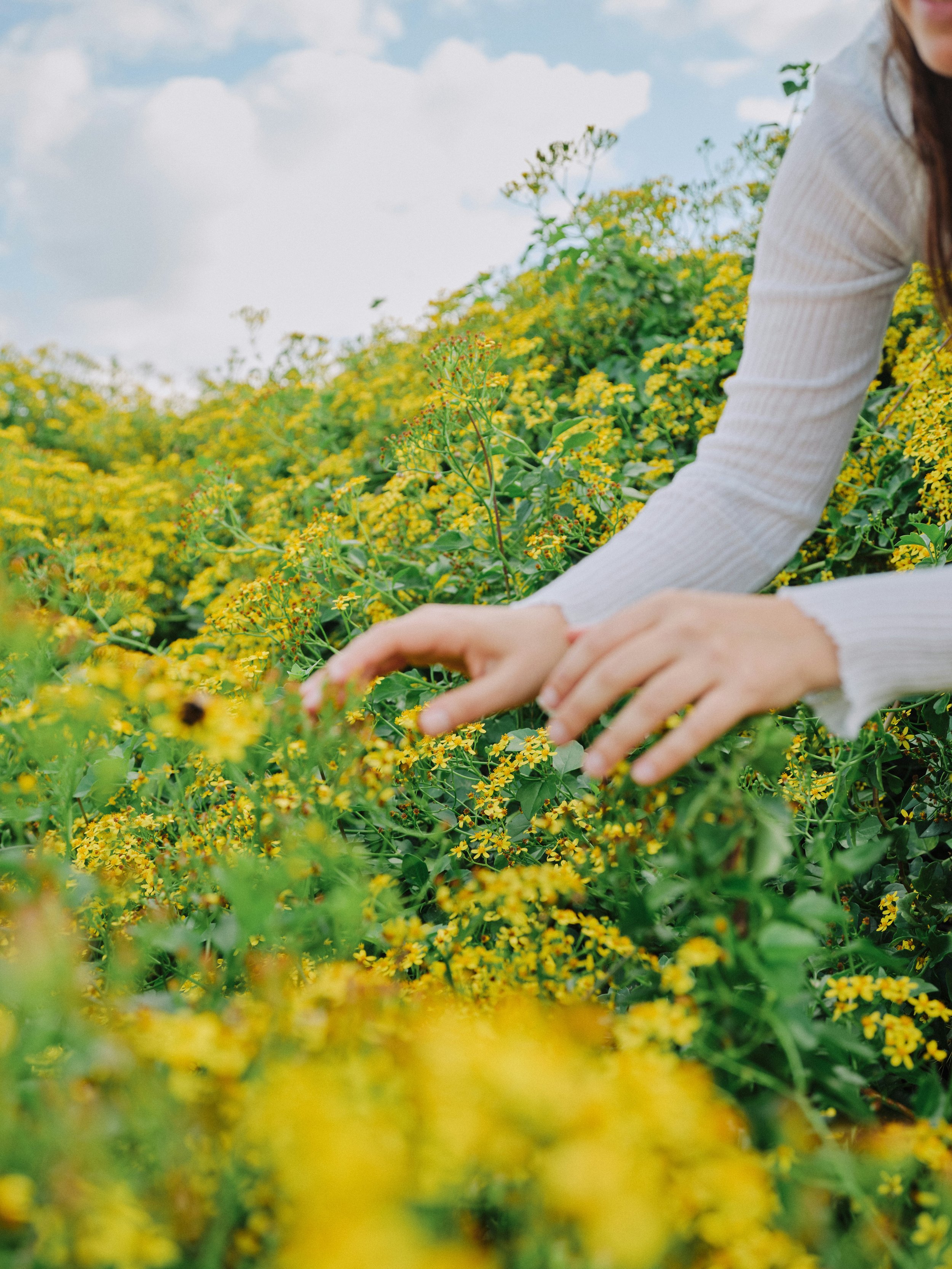
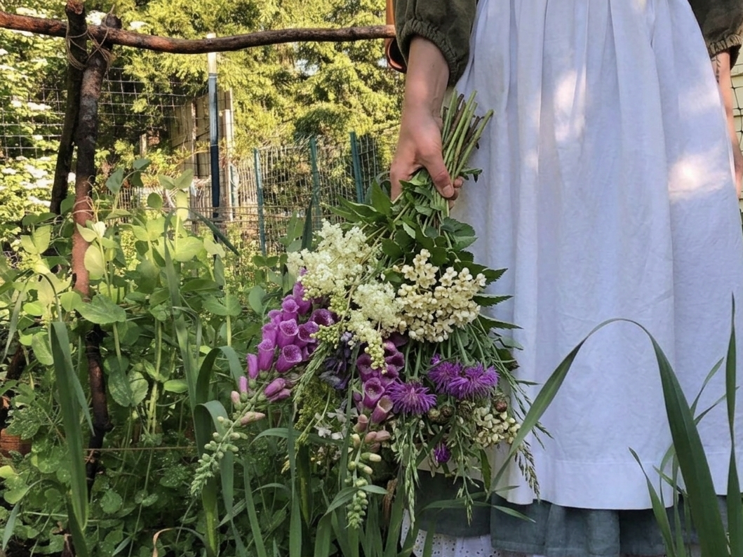
Bringing the Dublin Herbalists brand into full bloom. A rebrand drawing direct inspiration from the colour, movement and sunny optimism of an Irish wildflower
hedgerow
/02
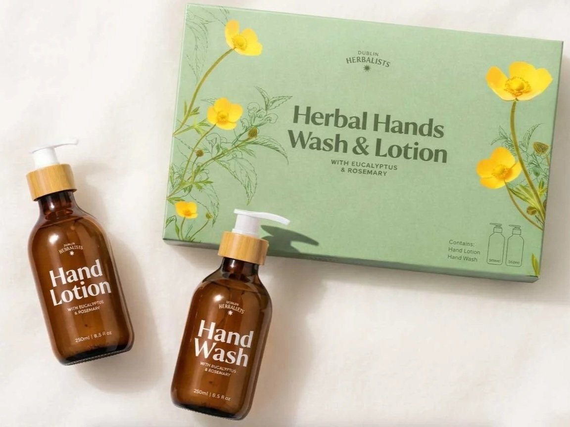
Dublin Herbalists
(A) Category_Skincare
(B) Project Type_Brand Redesign
The Nice Things are working in partnership with founder Claire Brett on an evolving, layered collaboration that grows alongside the brand as it grows into full bloom. We started by taking the brand through a comprehensive strategy process gaining insights from market research including interviews with wholesale buyers, customers and internal stakeholders. We discovered something lovely, a loyal connection to the products, a genuinely playful personality, and a joyful relationship with colour that customers consistently lit up for. With these elements already present in the brand, our job was to evolve that brand personality in close collaboration with Claire.
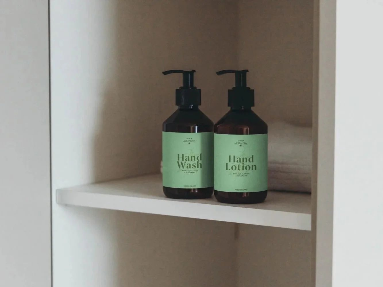
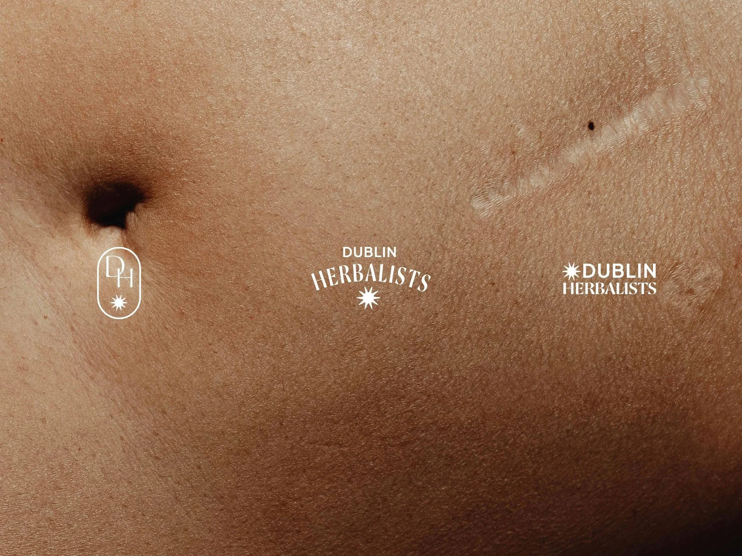
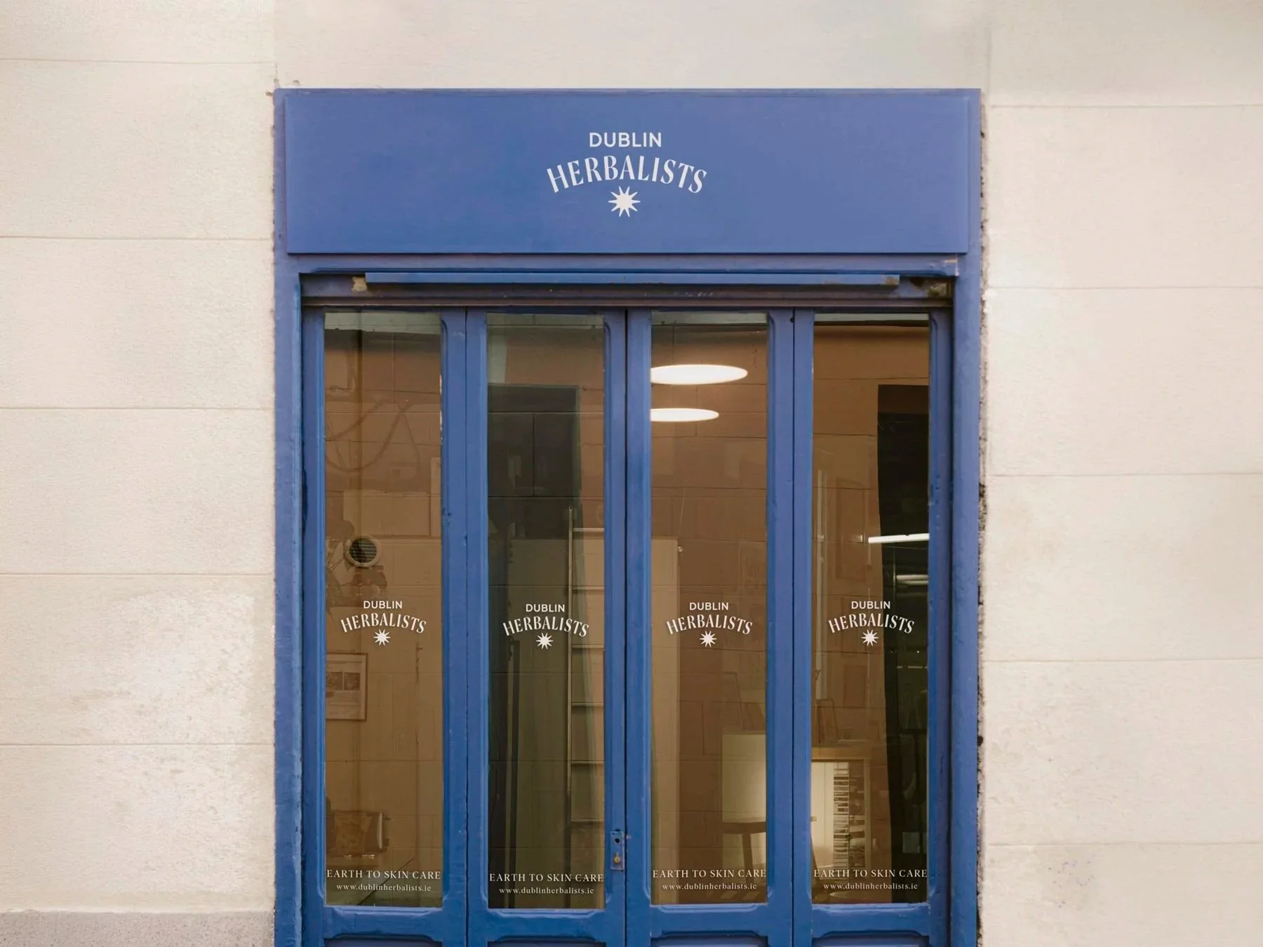
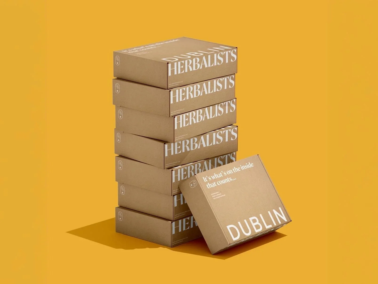
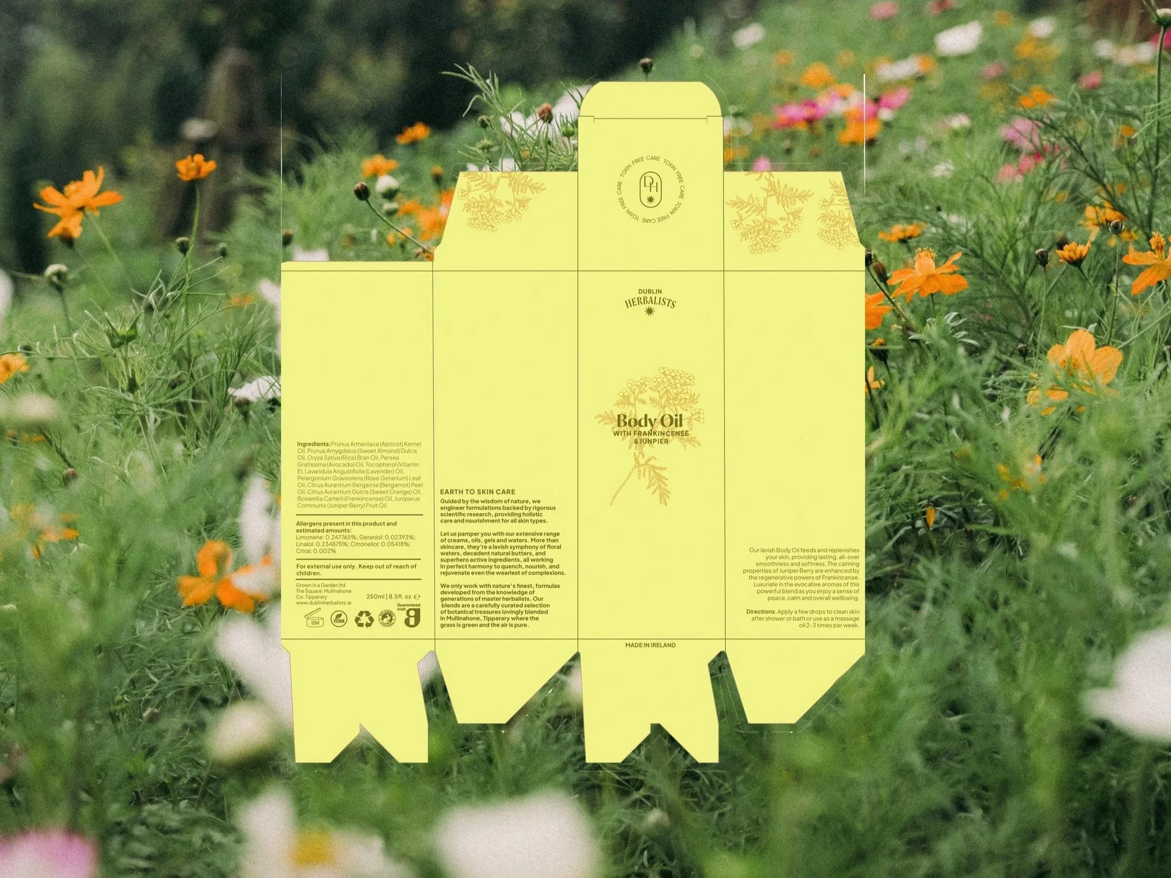
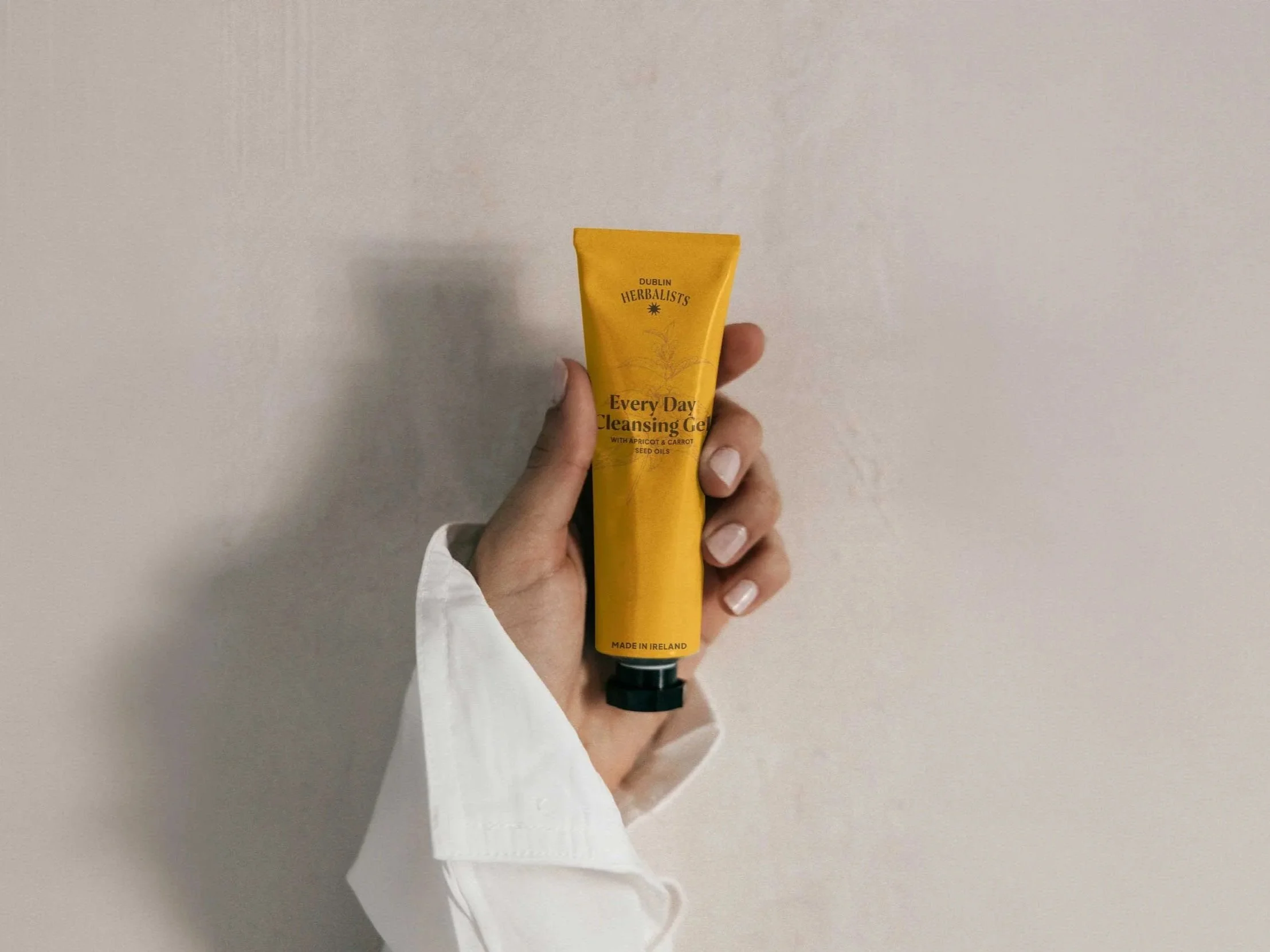
A clear picture of the Dublin Herbalists customer emerged as a down-to-earth, practical woman who values products that simply work. With her in mind, we refined the visual language around the lush landscape of Tipperary. The logo and submark draw from vintage apothecary bottles, a nod to the alchemical roots of the brand and Claire's deep knowledge of herbalism. A small hand-drawn star carries the sense of magic present in every ingredient. A wider brand system and colour architecture brings greater clarity and consistency. For a brand inspired by the earth, it was only right that every piece of packaging has been designed to be kind to it.
(C) Scope_Brand Strategy, Logo & Identity, Packaging
THE RESULT
A new rhythm for retail storytelling. By combining cinematic campaigns with native social content, Kildare Village achieved on average 300% increase in reach while establishing a visual language and pace of content that continues to shape the brand today.
(1) A 300% increase in reach through a combination of hero campaigns and native social storytelling.
(2) Established a recognisable and enduring visual language for one of Ireland's leading retail destinations.
(3) Multiple pieces of content surpassed 100,000 views, expanding awareness and engagement across key audiences.
(3) A considerable and measurable increase in direct sales from the moment the new identity launched.
“We worked with Marion to explore and refine our brand, what it means, how it looks, and the values and vision that drive us as a company. Throughout the process, we developed a comprehensive brand book, gained a deeper understanding of our customers, and clarified the energy behind the Enibas brand. The end result has become a foundation for our culture, guiding the values we stand by and shaping the way we present ourselves today. We’re still using the same packaging, with only small enhancements along the way, because the work we did together established such a strong base. ”
Anna Leah Lenz, Co-Founder at Enibas